Home Blog Page 10

The Art of Tablescaping: A Seasonal Guide to Dining Decor

We eat every day, but we do not “dine” every day. The difference between a dinner on a Tuesday night, and a dinner to remember, has less to do with the recipe than with the ambiance.

“Tablescaping” is the art of setting a scene. It has nothing to do with displaying china or making napkins look like swans. It has everything to do with telling your guests that they are important. It is a way of creating a tangible space that will enable a conversation to continue well beyond the time that the food has been consumed.

read more: Open Shelving Styling: How to Curate Functional Art in Your Kitchen

Here’s how to dominate the table all year round:

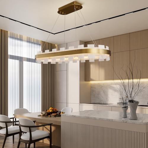
The Rule of Sightlines

One of the biggest decorating don’ts at the dinner table is the “Wall of Flowers.” You set up this huge floral arrangement right in the middle. It’s impressive until diners arrive and sit down. Then you can’t see the person opposite you. This leads to a dysfunctional conversation because the link is obstructed.

“The key to creating centerpieces,” interior designer Kaki Borton writes, “is to go low, or go high.”

The decorations should either be below eye level think about bowls of fruit or moss, or glasses of flowers or very tall and slender, such as candelabra that loom above heads. If you find yourself leaning on one elbow to ask someone to pass you the salt, table-setting design is not your friend.

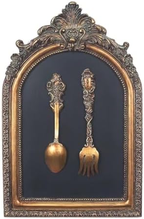
Texture, Not Color Addition

A flat surface is like a cafeteria table. Texture is needed if the table is to be luxurious. Contrary to the required color combination, texture is much more essential.

Begin with linens. The slightly wrinkled tablecloth is more welcoming and contemporary than a starched white tablecloth. The tablecloth means “relax.”

Add layers. If you do use a tablecloth, forgo placemats and add a charger plate. If your table is wooden and you do not use a tablecloth, start with a table runner. This will help center everything.

Mix materials. If your plates have a smooth ceramic texture, you should use placemats made of woven materials and metal napkin rings. Such contrast between rough and smooth elements creates a visually interesting effect in terms of reflecting light.

Lighting: The Mood Manager

You can have the finest food that you’ve ever tasted, and you can have the most gorgeous flowers, but if you use bright overhead lighting to light the room with LEDs, the ambience will be clinical.

The overhead lighting is for cleaning, not for dining. Turn the big lights out. Use table lamps on a sideboard, or fall back on plenty of candles.

A word on candles: They should be unscented. This is not negotiable. A vanilla or lavender scent does not belong in competition with either the scent of roast chicken or wine. Beeswax candles or white tapers are just fine. The flickering light adds motion and helps all of the people around the table to look better.

A Seasonal Framework

A set of dishes is not required for each season. Only the organic part has to change.

Spring: Keep it loose. Use bud vases with single stems of tulips or daffodils rather than bouquets. Pastel-colored napkins and glass add a light feel.

Summer: Embark on making it durable. This season celebrates al fresco dining. It requires heavy glasses that won’t upend due to windy conditions. Add elements of fresh citrus, lemons, and limes direct tabletop decor.

Autumn: Bring the outdoors in. Use dried leaves, branches, and dark colors. Replace white candles with bright red or burnt orange. It is also the season when you can go for heavy texture materials, like velvet ribbons or wool mats.

Winter: It’s a season of warmth and reflection. You don’t need to resort to cheesy winter themes. Think highly reflective materials—brass, silver, and gold reflecting candlelight. Evergreen branches are free. Cut a few in your yard to place down the center of the table.

The Personal Touch

To conclude, the key component of a table arrangement with the greatest effect on an event environment, costing nothing, is the place card.

Placing a name on a small index card accomplishes two things. First, it obliterates “the Where do I sit?” dance that takes place at every dinner party. But perhaps more importantly, it says to your guest, “I set aside this place for you alone. I wanted you to feel like you belonged here.”

The art of hospitality.

read more: The Psychology of Space: Creating Flow in a Luxury Kitchen

The Psychology of Space: Creating Flow in a Luxury Kitchen

We’ve all known what it means to be in a kitchen that just didn’t feel right. Maybe it was filled with high-end marble and high-end appliances, but it was just too small the minute two people entered it. You were constantly ducking to avoid the dishwasher handle or running into the island just trying to grab a glass of water.

This is not a failure of budget, this is a failure of psychology.

High-end design involves the concept of “flow,” which represents the unseen force that leads people throughout a space. Flow represents the distinction between a kitchen that photographs well and a kitchen that functions well. When discussing the psychology of space in a high-end kitchen, what is being described is the concept of reducing friction. The objective is to provide a space whereby the mind does not have to consider movement; the body will intuitively know where to go.

read more: The Evolution of the Toaster: From Fire Hazards to Smart Tech

The Death of the Triangle

Architects for decades worshipped the so-called “Work Triangle” configuration from the sink, through the stove, to the refrigerator. There was a reason for the worship in the 1950s. The kitchen was a small isolated area which was inhabited by only one person.

The triangle has no place in state-of-the-art high-end homes. In today’s design concept, it’s all about “Zones.”

“The psychology at play is that of task reduction,” WestEnder explains. “What you want to happen is that if you’re making coffee, for example, you shouldn’t have to walk through the path of the person cooking eggs.”

A luxury kitchen includes a coffee station where you can prepare your brew because “you want all of the cups, all of the beans, and all of the water in reach.” There is also a prep area “with its own sink and its own trash chute,” because by dividing “the room into self-contained areas,” you eliminate “the crossing of traffic that creates mental stress.”

The Island as a Social Barrier

The kitchen island is no mere countertop but a psychological barrier. Guests are cooking and making contemporary conversation in a hosting setting. If there were no barrier, then guests would wander into the cooking area and cause congestion and potential dangers.

An effective kitchen island is like a stage. It distinctly separates the “Actor” (the chef) from the “Audience” (the dinner party).

To create this flow, seating needs to be located on the outside edge with minimal traffic on the inner aisle. The “Proximity and Safety” principles of psychology relate to this. The guests need to feel close enough to participate in what is going on but can feel safe with the physical buffer of the island.

Sight Lines and Mental Peace

Humans also have an “Evolutionary Preference for Prospect and Refuge.” “We enjoy watching what is happening while still being protected.”

An elite kitchen has maximum sight lines. As a kitchen designer, you should be able to see the dining area, outdoors, or living area when standing at the main preparation area. When a cook has a blank wall, it promotes a sense of isolation.

This too applies to clutter. The brain recognizes clutter as an incomplete task. This is why “Sculleries” or “Butler’s Pantries” are having a gigantic resurgence as a design statement in high-end design. This catch-all room gives you a place to stash clutter like toasters, blenders, and dirty dishes out of sight. This way, it keeps the psychological peace in the kitchen with a clear design statement that invites relaxation for the brain.

Light as a Guide

And, finally, everything that exists, or in other words, all substance, is ruled by light.

“Layered Lighting” will solve this problem. First, you have to have good, strong, focused task lighting above the work areas for safety reasons. Yet for a warm effect, you have to have soft, warm “ambient” lighting under the cabinets or toe-kicks.

“When lighting is well-balanced, a room feels open. It is an invitation to enter. True luxury is not simply a function of what one touches. It is a function of how one behaves without even realizing it.”

read more: Open Shelving Styling: How to Curate Functional Art in Your Kitchen

Open Shelving Styling: How to Curate Functional Art in Your Kitchen

Open shelving is probably one of the most divisive elements of modern kitchen design. Open shelving is either a chance to showcase beautiful ceramics and achieve a light and airy feel that is perfect for a kitchen, or a dusty nightmare of a disaster zone for many people.

The difference between those two worlds always comes down to one thing: curation. If you think about your open shelves like a typical kitchen cabinet—just a place to throw in everything that doesn’t fit in Tupperware boxes that don’t match then it will just be cluttered. But if you think about it in terms of a display piece of so-called functional art, then everything in that kitchen changes.

Applying her idea about a kitchen can be a wonderful application for any place in your home that you’d rather not dust. Though it is difficult, it is actually possible to create stylish shelving, and it’s not hard once you see what works.

The Dust Defense: Use it or Lose it

The strongest argument against open shelving is the presence of dust, but this is only a problem if you are displaying items that you do not use often.

The key to open shelving, according to Holly Becker of APieceOfCake.com and author of “Decorating a House That’s Young at Heart,” is to only display what’s essential. Your plates, cereal bowls, and glasses should be in this area. You use these items enough that the dust never has a chance to accumulate.

Your gravy boat and/or your casserole dish that you use only annually don’t belong on an open shelf. Keep your shelves full of activity. If something is not in use, it should be behind a door.

The Three-Tone Limit

Closed cabinets are easy to work with; they cover a multitude of sins. Open shelving reveals everything. If you are a collector with ten colors of mugs with matching logos, the open shelving will look cluttered. To achieve the calm look, you have to learn to contain yourself when it comes to color.

Keep the palette to only three tones. For instance, white ceramics, wood, and glass. Or perhaps black, stoneware, and copper. By doing this, you ensure that all the items, which could be different, are part of a harmonious group. This allows your eyes to easily sweep along the shelves without resting on a bold red logo.

Defying the Ceramics Tedium

Having a shelf full of plates neatly stacked together may give a rather sterile feel to it, as though it were a cafeteria at a hospital. In order to get a homely feel, there should be variation in the material used.

Add texture to vary from the glossy pottery. Prop a wood cutting board against a back wall to introduce warmth. Fill a few glasses with pasta or oats and set them out to introduce texture. Consider adding a small plant for natural texture or a pepper mill for shine. The idea is to achieve contrasting textures between hard and soft and between matte and glossy.

Breathing Room and Balance

The biggest error in regards to this space is overfilling the space. Because the shelf is three feet long does not mean you need three feet of things.

Negative space: The space between objects is as important as the objects. It serves as resting points for the eyes. Do not stack plates all the way up to the next shelf. Leave space at the top. Do not stack bowls against the glasses. Leave space between the bowls and glasses. Organize objects in odd-number groups such as three bowls or five mugs. Leave space between the groups.

The Verdict

Organizing open shelving is about styling and editing. It challenges you to consider what you actually like enough to showcase. It prevents you from becoming a hoarder because you literally cannot hide your stuff. Ultimately, a well-styled shelf is about more than just aesthetics. it’s a celebration of the tools that sustain your family.

read more: The Evolution of the Toaster: From Fire Hazards to Smart Tech

The Evolution of the Toaster: From Fire Hazards to Smart Tech

We consider the “pop” process nothing short of ordinary. You place two slices of bread into a slot, press a lever, and two minutes pass, and breakfast appears. But for the bulk of historical time, the process of toasting bread on either side of the Atlantic was an extreme sport. You had long forks, open fire, and a good chance of burning your fingers, your bread, or yourself.

The history of this toaster has nothing to do with warming carbohydrates. This is our story of how we harnessed technology to overcome breakfast rush.

The Age of Wire and Fire

Prior to the 20th-century era, electricity was a novelty and a hazardous item. The early versions of electric toasters, which emerged in the 1890s or 1900s, were effectively a metal framework hanging in the open, with red-hot wires strung around it. These were frightening pieces of equipment.

These first models, such as the General Electric D-12, had neither sensors nor housing. You put the bread on the grill and had to watch it until it was done on one side before flipping by hand the scorching hot slice to finish cooking it on the other side. Guess what happened if you got caught up in reading the morning paper? You wound up with toasted bread and a burning kitchen if you weren’t watching it minute by minute.

The Invention of Nichrome

However, it’s not the chef who should be credited as the hero of the toaster. Instead, it’s an engineer by the name of Albert Marsh. In the year 1905, Marsh invented “Nichrome,” which stood for an alloy of nickel and chromium.

This was important because, prior to its creation, wires that were intended to be heated would either turn to liquid or break down in just several uses. Marsh made it possible to have a wire that could be heated to bright red thousands of times without turning to liquid. Without Nichrome, there would be no toaster or hair dryer in today’s world.

The Pop-Up Revolution

“The dissatisfaction associated with burned toast is an important motivator,” says the book “The Innovator’s DNA.” World War I provided the backdrop in which Charles Strite, an inventor and mechanic, grew frustrated that the cafeteria in which he ate served “charcoal” toast for breakfast. “He wanted to eliminate human error from his decision.”

In 1919, Strite invented the first pop-up toaster, called the “Toastmaster” when released to the public in 1926, and used a clockwork timer and springs to pop the toast into the air when it was toasted to the owner’s liking. Now, you could let the toaster do the work without necessarily watching over it. The toaster went from something that could burn you to something that you could rely on.

Brief History: Chrome to Computers

By mid-century, the toaster had achieved iconic status. The chrome and rounded design of the 1950s elevated this appliance into the centerpiece of the formal table. However, the principle and function had changed little since then: heat, timing, and spring power.

Current technology brings us into the age of “smart toaster” products. The latest smart models incorporate steam technology, which maintains a moist environment inside while crisping the outer layers. Some models allow users to select their preferred bread type, such as sourdough or bagels, via a touch screen.

We have moved a long way from the use of open flames, a practice that was common in the Victorian age. But whether it is a rusty iron fork or a Wi-Fi-enabled robot, the motive remains the same: the crunch!

read more: Timeless Kitchen Design: Balancing Modern Function with Classic Aesthetics

The Hidden Kitchen Philosophy in ‘Fight Club’: The IKEA Nesting Instinct

When was the last time you bought a kitchen gadget because you needed it? Not because it looked cool, not because some magazine told you to, but because you truly couldn’t cook dinner without it?

In the cult classic Fight Club, directed by David Fincher and released in 1999, the main character is fighting neither man nor beast at the start of the story. He is fighting his furniture. There is a well-known monologue in which the Narrator is flipping through an interior design catalog and speaking lovingly of his furniture, as one might speak of his lover. He refers to it as the “IKEA Nesting Instinct.”

This idea strikes a chord for anyone who loves design. It means that our fixation with the relentless search for the ultimate coffee cup, the ultimate table, it’s not a matter of taste. It’s a matter of trapping ourselves.

read more: The Scandalous History of the Fork: Why It Was Once Considered Demonic

The Catalog as Identity

The Narrator then poses a frightening question: “What kind of dining set defines me as a person?”

This is the heart of the criticism in this movie of family life. It is our perception that, by acquiring a hand-blown green glass bowl with small air bubbles and nicks, we will be interesting. It is our perception that, by owning a particular brand of stand mixer, we will appear to be competent, caring, and successful.

Fight Club contends that this is only a lie. The Nesting Instinct is simply the desire for a safe place. It’s been hijacked by consumer culture. We find ourselves filling our kitchens with objects not to use, but to project the shell of our personalities.

Blowing Up the Perfect Kitchen

The turning point of the film comes into place when the condo of the Narrator blows up. His “Yin and Yang” coffee table and his perfect refrigerator get destroyed instantly.

It is a nightmare for foodies or design aficionados. But for the characters in Fight Club, it is liberation. Tyler Durden, the anarchistic version of the protagonist, spreads the message about how “The Things You Own End Up Owning You.” Without the perfect kitchen, the Narrator must live in a rundown house on Paper Street.

The kitchen at this point is no longer just revolting. It has the functionality, the rawness, of survival. There’s no talk of color schemes or material texture. There’s just action and survival.

You Are Not Your Coffee Maker

The philosophy here isn’t that we should all live in squalor. It’s a reminder to separate the tool from the self. It’s easy to get caught up in the idea that one cannot be a good cook without a $300 knife, that one cannot hold a dinner party without the corresponding china.

Fight Club awakens us to the fact that these are mere things. Therefore, go and purchase the nice table. Enjoy your well-designed chair. Just remember the moral behind the IKEA Nesting Instinct. The table is meant for your food. Not for your soul.

read more Making Home: How Design and Architecture Shape Our Domestic Life

Timeless Kitchen Design: Balancing Modern Function with Classic Aesthetics

Kitchen renovations are expensive, stressful, and loud. The last thing anyone wants is to finish a remodel, stand back to admire the work, and then realize three years later that your choice of tile screams “2024” in the worst possible way.

We have all seen those kitchens: the ones with the avocado green appliances from the 70s or the Tuscan brown granite from the early 2000s. They act more like time capsules rather than functional spaces. The antidote to this is “timeless design.” But timeless doesn’t mean boring, and it certainly doesn’t mean ignoring modern technology. It means building a foundation that survives the trend cycle.

Here’s how to create a kitchen that feels permanent but functions perfectly for modern life.

The Foundation is Silence

The first thing you notice when you look at a well-aged kitchen is one thing: the permanent elements are quiet. The floors, usually neutral, along with the cabinets and the countertops.

The “Shaker” style cabinet is gold right here. Centuries apply because it’s simple. It doesn’t try too hard. If you choose a simple cabinet door in wood or a painted neutral tone, you’re creating a blank canvas. You can always change the hardware or the wall paint later if you get bored, but the “bones” of the room should remain steady.

Lying About Your Appliances

We want the convenience of the 21st century, but we often want the aesthetic of the early 20th century. The solution is deception.

Technology should be felt, not seen, in a timeless kitchen. This is why panel-ready appliances are so important. It’s that giant stainless steel refrigerator that dominates a room and instantly dates it. Cover that fridge in the same wood paneling as your cabinets, and it disappears. It lets the eye focus on the architecture of the room, rather than the brand of your cooling system.

It’s the same thing with the microwave: don’t mount it above the range. Tuck it in a pantry cabinet or below the island. Only the range itself is worthy of being a focal point, since for the most part, a heavy iron stove is never out of style.

read more: Linen & Textiles: Selecting and Caring for High-Quality Napkins & Cloths

Natural Materials Age, Synthetics Just Break

And there’s a reason marble, soapstone, and unlacquered brass have remained popular after hundreds of years: They develop a “patina.”

A scratched plastic laminate countertop looks ugly. An etched marble countertop looks “lived in”. It tells a story. Unlacquered brass handles will darken and change color where you touch them most. The kitchen is warmer and more inviting as the years go by because of this living quality, not merely worn out.

Lighting: The Jewelry of the Room

If the cabinets are the suit, the lighting is the watch. This is one area where you can lean a bit more modern or decorative without ruining the timeless feel.

But more important than the fixture is the placement. Modern function demands layers of light. You need under-cabinet LEDs for chopping veggies, and you need warm pendants above for dining. Here’s the secret: the light source itself—the bulb or strip—should be invisible. You should only see the effect of the light, not the technology producing it.

The Verdict

Any design that will remain timeless does require some restraint. It asks that you ignore the bright, shiny trend you saw on social media this morning in favor of something that has worked for fifty years. It might feel safe, but when you are still in love with your kitchen a decade from now, you’ll be glad you chose longevity over noise.

read more: Heirloom Cookware: Why Copper and Cast Iron are Worth the Investment

Making Home: How Design and Architecture Shape Our Domestic Life

“Architecture” is often something grand: an art museum, a high-rise building, a cathedral. But the most significant architectural fact in your life is neither the tower where you work nor the house where you live; it is the four walls between which you wake up every morning.

There is a clear difference between a “house” and a “home.” A house refers to the physical structure that guards you against the rain. A home, on the other hand, is something created by design, something psychological. The design of the hallway, the direction of light entering the kitchen, or the height of the ceiling is more than just changing the appearance of the space. It alters the manner in which occupants act.

Here is how the invisible hand of design affects our domestic life.

Architecture of Friction

Do you ever feel nervous walking into a room when there is no particular reason why? This is what is meant by the failure of flow.

A “circulation route” is a term used by architects, and basically, it refers to how one moves around a room or a series of rooms. Good design ensures smooth passage, where, for example, one can go from where one sleeps to where one brews one’s coffee without stumbling past a poorly positioned “island” or down a dark “corridor.”

Good design is invisible. You don’t forget that the window is installed just where you would like to stop for a moment to look out at the view. You just notice if it’s not right. Poor architecture makes you shape your life around a building, while good architecture makes a building adjust to your life

Light as a Material

We use the switchable nature of light, but from an architectural perspective, light has physicality, just as wood or concrete does. Light sets the pulse of time.

An eastern-oriented bedroom will make you wake up with the sun, synchronizing your biological clock. A living room that provides low and warm lighting at night will signal your brain that it is time to sleep. The positioning of windows goes beyond the aesthetic of enjoying a view; it also involves energy management within a dwelling. A dwelling that lacks light feels as if it is stagnant because it separates its inhabitants from time.

read more: The World’s Best Design Museums for Food Lovers: A Global Guide

Defining Domestic Architecture

But what essentially distinguishes domestic architecture? This, it seems, is the discipline that engages the design of space not for public aggrandizement but for private communion. As such, domestic architecture differs significantly from public architecture, as the latter engages the design of space that serves the flow of many, not the stasis of the few.

The Open Plan vs. The Broken Plan

For so long, the advice consisted of tearing down walls. Open Plan living became the holy grail, a single massive space for cooking, eating, and TV viewing. But now, the attitude has changed.

We’re learning that walls have a purpose. They give us sound separation and psychological privacy. There’s a shift taking place toward “broken plan” homes, where shelves, countertops, or “broken” walls divide spaces. Apparently, being able to listen to the dishwasher while attempting to read a book is not the freedom we dreamed of. We want nooks. We want places to hide.

The Adjacent Possible

Ultimately, the making of a home has little to do with finding the right couch. It has almost entirely to do with understanding the relationship between space and emotions. What a low ceiling creates as a sensation is cozy, yet suffocating, while what a long view creates is liberating, yet exposed.

When we plan our homes, we are in fact planning our future selves too. We are choosing how we want to live, interact, and sleep. Therefore, the next time you gaze into a floor plan, not only are you considering the size in square footage, you are considering the life that the floor plan provides as well.

read more: Why Wine Bottles Are 750ml? The History Behind the Standard

When Kitchen Tools Become Art: 5 MoMA Masterpieces You Can Actually Buy

Open your utensil drawer. What do you see? A jumble of black plastic spatulas, a garlic press that never works, and a can opener that you loathe. These are tools. These are things we use and then clean and store away.

However, there is another type of kitchenware. This includes objects in which the boundary between “appliance” and “sculpture” gets blurred. They are so perfectly designed that the curators of the Modern Art Museum in New York feel they are meant to be placed on the same pedestal as the works of Picasso.

The catch: Unlike a Picasso, you can afford to display these masterpieces on your counter. Here are five design icons who show form follows function:

1. The Chemex Coffee Maker

Creator: Peter Schlumbohm (1941)

It doesn’t look like a coffee maker as much as laboratory equipment, and this is appropriate, given its origins in the lab of a chemist.

“The Chemex is, in my view, the supreme example of mu-sho, this aesthetic of simplicity through reduced complexity, through diminished complexity, through rediscovered simplicity.”

There are no mechanical parts to break, no circuitry to malfunction, in this product that is hailed as one of the greatest designs of the modern era because it reduces the process of coffee-making to its bare essentials.

2. Rex Vegetable Peeler

Designer: Alfred Neweczerzal (1947)

You will be amazed to see a device that costs less than a lunchbox sitting in a glass case at MoMA. The Rex Peeler is the epitome of the word “Humble Masterpiece.”

Made out of a single aluminum sheet, it is almost weightless, ergonomically delightful, and almost unbreakable. This device shows that design need not emphasize richness; it must emphasize the solution of a problem using the minimum amount of material.

3. Alessi 9093 Kettle

Designer: Michael Graves (1985)

Before this kettle, boiling water was a dull task. However, Michael Graves, an architect from America, made it a work of Pop Art.

Of course, its cone shape is very unique, but what is most brilliant about it is a tiny red plastic bird perched on top, singing when the water reaches boiling points. It brought a playful and optimistic note to a dull kitchen area where morning tea is taken.

4. Fiskars Orange-Handled Scissors

Designer: Olof Bäckström (1967)

A pair of scissors with orange handles in your supply cabinet is a piece of design history. When Fiskars decided to create a scissor with plastic handles in 1967, because they wanted to make scissor handles more comfortable, the machinist had leftover orange plastic from a juicer project.

They decided to use this leftover plastic solely for this scissor design project. This design became a permanent display at MoMA.

What is “Functional Art”?

Why are these items in a museum collection? Museums collect kitchenware not for its scarcity, but for its historical importance as it signifies an achievement in Industrial Design. These items provide solutions for complex functions of peeling, brewing, or cutting in aesthetically symbolic designs, which signify their time. These items are termed “Functional Art” because of their perfect function

5. Stelton EM77 Vacuum Jug

Designer: Erik Magnussen (1977)

This iconic Danish design can be identified by its cylindrical shape and the distinctive rocker stopper. It doesn’t shout to get attention, but it demands it through its quietness. This epitomizes extreme Scandinavian design, which adds nothing if it isn’t absolutely necessary.

So, the next time you’re considering a new tool, it might be helpful to think not just about what will work, but what will be worth a second glance.

read more: The Scandalous History of the Fork: Why It Was Once Considered Demonic

Cinema’s Most Iconic Kitchens: From ‘Julie & Julia’ to ‘Ratatouille’

There is something honest about what we are talking about here. Kitchens are messy. There are crumbs in the toaster, a stuck drawer, and lighting just out of target parameters. Not so in movies. There, a kitchen is never just a room; it’s a refuge, a struggle, or a dream.

We all remember the point in a film where we are not watching the storyline at all but are instead gazing at the copper pans hung up in the corner. Movie kitchens are one thing that real-life kitchens never accomplish, and that’s because they always capture the ambiance that the chef in the kitchen exudes.

These are the movie sets that are benchmarks for kitchen envy.

Julie & Julia: The Warmth of Chaos

To experience what it’s really like in the kitchen, take a look at Julia Child’s apartment in Paris. Designers did not create a sleek environment. Instead, they designed it to be cluttered.

That’s the pegboard wall that Nigella’s copper pans are traced against in black marker,” wife and foodie blog author Kathy explains. “That’s more than just storage; it’s a topography of a passionate brain. It feels doable. It tastes like butter through the screen. This line of products has taught a whole generation that you don’t have to go minimalist in order for the kitchen to be pretty. You just have to use it.

Ratatouille: The Professional Dance

Ironic, in this case, is that the most truthful representation of what a professional French kitchen looks like is in cartoon rat form. Pixar took weeks in Paris to take note of every detail in their restaurants.

While the homey atmosphere of Julie & Julia prevails in the former kitchen, this one is industrial-scale and hierarchical and simply terrifying. The warmth of the burnished copper, the cast-iron stoves, and the checkerboard floor creates a rhythmic effect. It is an embodiment of what is called the “brigade system” whereas the kitchen is no longer a place for leisure but is actually a precision machine.

It’s Complicated: The Nancy Meyers Fantasy

It would not be proper to mention movie kitchens without also mentioning Nancy Meyers. Because of her, now everybody in America needs to have two dishwashers and an island that is a small car.

The baker’s shop and the kitchen in the house in It’s Complicated are the epitome of the “calm capability” that we all seek. The kitchens are shockingly spotless, with bowls of lemons that never get used and a golden glow unlike anything in real kitchens that spill over with warmth and love. The kitchens are the ultimate ideal of a life where cooking never gets stressful, only happy.

The Set Design Secret: The Kitchen as a Character

But why do we remember these kitchens? In moviemaking, the kitchen is always crafted as an extension of character personality. Julia’s kitchen is cluttered and cozy because she is. A Ratatouille kitchen is stiff and serious because the character is.

So, you shouldn’t be discouraged if your kitchen is no movie set. Unless you happen to be lighting a corner full of lighting guys, it will never be. But a little bit of borrowings, like a pegboard and a bowl of lemons, won’t hurt, right?

read more: Why Wine Bottles Are 750ml? The History Behind the Standard

Why Wine Bottles Are 750ml? The History Behind the Standard

Have you ever found yourself in a grocery store, looking at wine, wondering why this is the size of wine. Milk is in a liter. Soda is in a liter. Wine, however, remains proudly in 750 milliliters. It is not a liter, nor is a pint. Why is this?

Hardened romantics might argue it is “the perfect amount of wine for a dinner party of two,” while others believe it was “the daily allotment of a Roman centurion.” Both are very colorful, and yet the truth is much more boring and very calculating.

The reason for the standard bottle size is actually a calculation based on 18th-century human lung capacity and British math.

read more: The Most Expensive Kitchen Antiques Ever Displayed in Museums

The Glassblower’s Limit

Prior to the 19th century, bottles were not produced by machine but were blown by hand. A glass maker blows the glass from the pipe to form the desired shape.

This leads us to a physical constraint. A glassblower had just enough lung capacity to produce a 600-800 ml bottle with a single breath. Going beyond that was just holding too much air, while anything less was a waste of effort. Consequently, 750 ml was anything but standard; it was simply what was easiest for a human physically.

The British Gallon Math

But biology is only part of the story. The other part is that standardization came out of trade. In the 19th century, the French produced the most wine, and the British consumed the most wine. It is a metric nightmare: the French measured in liters, and the British in imperial gallons.

A standardization of size was required in order to simplify trade. Here is the calculation involved: One Imperial gallon is about 4.5 liters. If this gallon is divided by six, the result is exactly 750 milliliters.

This is why wine is packaged in cases of six or twelve to this day. For the British traders, the case of six bottles was exactly equal to one gallon. This made pricing or calculating taxation and transportation lists extremely easy.

A Definition of Trade, Not Taste

Therefore, the next time you pour a bottle, remember that you are opening something more than a beverage. You are opening an artifact that is measured by the breathing power of an 18th-century laborer and the calculations of a British businessman.

But the 750 ml standard was never about wine per se but about making wine easier to sell. It is a classic illustration of how history responds to logistical imperatives to create our modern meal, confirming that some of our most delightful traditions begin with a math question.

read more: The Scandalous History of the Fork: Why It Was Once Considered Demonic

Classic Meals

- Advertisement -