Home Blog Page 37

Timeless Kitchen Design: Balancing Modern Function with Classic Aesthetics

Kitchen renovations are expensive, stressful, and loud. The last thing anyone wants is to finish a remodel, stand back to admire the work, and then realize three years later that your choice of tile screams “2024” in the worst possible way.

We have all seen those kitchens: the ones with the avocado green appliances from the 70s or the Tuscan brown granite from the early 2000s. They act more like time capsules rather than functional spaces. The antidote to this is “timeless design.” But timeless doesn’t mean boring, and it certainly doesn’t mean ignoring modern technology. It means building a foundation that survives the trend cycle.

Here’s how to create a kitchen that feels permanent but functions perfectly for modern life.

The Foundation is Silence

The first thing you notice when you look at a well-aged kitchen is one thing: the permanent elements are quiet. The floors, usually neutral, along with the cabinets and the countertops.

The “Shaker” style cabinet is gold right here. Centuries apply because it’s simple. It doesn’t try too hard. If you choose a simple cabinet door in wood or a painted neutral tone, you’re creating a blank canvas. You can always change the hardware or the wall paint later if you get bored, but the “bones” of the room should remain steady.

Lying About Your Appliances

We want the convenience of the 21st century, but we often want the aesthetic of the early 20th century. The solution is deception.

Technology should be felt, not seen, in a timeless kitchen. This is why panel-ready appliances are so important. It’s that giant stainless steel refrigerator that dominates a room and instantly dates it. Cover that fridge in the same wood paneling as your cabinets, and it disappears. It lets the eye focus on the architecture of the room, rather than the brand of your cooling system.

It’s the same thing with the microwave: don’t mount it above the range. Tuck it in a pantry cabinet or below the island. Only the range itself is worthy of being a focal point, since for the most part, a heavy iron stove is never out of style.

read more: Linen & Textiles: Selecting and Caring for High-Quality Napkins & Cloths

Natural Materials Age, Synthetics Just Break

And there’s a reason marble, soapstone, and unlacquered brass have remained popular after hundreds of years: They develop a “patina.”

A scratched plastic laminate countertop looks ugly. An etched marble countertop looks “lived in”. It tells a story. Unlacquered brass handles will darken and change color where you touch them most. The kitchen is warmer and more inviting as the years go by because of this living quality, not merely worn out.

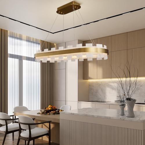
Lighting: The Jewelry of the Room

If the cabinets are the suit, the lighting is the watch. This is one area where you can lean a bit more modern or decorative without ruining the timeless feel.

But more important than the fixture is the placement. Modern function demands layers of light. You need under-cabinet LEDs for chopping veggies, and you need warm pendants above for dining. Here’s the secret: the light source itself—the bulb or strip—should be invisible. You should only see the effect of the light, not the technology producing it.

The Verdict

Any design that will remain timeless does require some restraint. It asks that you ignore the bright, shiny trend you saw on social media this morning in favor of something that has worked for fifty years. It might feel safe, but when you are still in love with your kitchen a decade from now, you’ll be glad you chose longevity over noise.

read more: Heirloom Cookware: Why Copper and Cast Iron are Worth the Investment

Making Home: How Design and Architecture Shape Our Domestic Life

“Architecture” is often something grand: an art museum, a high-rise building, a cathedral. But the most significant architectural fact in your life is neither the tower where you work nor the house where you live; it is the four walls between which you wake up every morning.

There is a clear difference between a “house” and a “home.” A house refers to the physical structure that guards you against the rain. A home, on the other hand, is something created by design, something psychological. The design of the hallway, the direction of light entering the kitchen, or the height of the ceiling is more than just changing the appearance of the space. It alters the manner in which occupants act.

Here is how the invisible hand of design affects our domestic life.

Architecture of Friction

Do you ever feel nervous walking into a room when there is no particular reason why? This is what is meant by the failure of flow.

A “circulation route” is a term used by architects, and basically, it refers to how one moves around a room or a series of rooms. Good design ensures smooth passage, where, for example, one can go from where one sleeps to where one brews one’s coffee without stumbling past a poorly positioned “island” or down a dark “corridor.”

Good design is invisible. You don’t forget that the window is installed just where you would like to stop for a moment to look out at the view. You just notice if it’s not right. Poor architecture makes you shape your life around a building, while good architecture makes a building adjust to your life

Light as a Material

We use the switchable nature of light, but from an architectural perspective, light has physicality, just as wood or concrete does. Light sets the pulse of time.

An eastern-oriented bedroom will make you wake up with the sun, synchronizing your biological clock. A living room that provides low and warm lighting at night will signal your brain that it is time to sleep. The positioning of windows goes beyond the aesthetic of enjoying a view; it also involves energy management within a dwelling. A dwelling that lacks light feels as if it is stagnant because it separates its inhabitants from time.

read more: The World’s Best Design Museums for Food Lovers: A Global Guide

Defining Domestic Architecture

But what essentially distinguishes domestic architecture? This, it seems, is the discipline that engages the design of space not for public aggrandizement but for private communion. As such, domestic architecture differs significantly from public architecture, as the latter engages the design of space that serves the flow of many, not the stasis of the few.

The Open Plan vs. The Broken Plan

For so long, the advice consisted of tearing down walls. Open Plan living became the holy grail, a single massive space for cooking, eating, and TV viewing. But now, the attitude has changed.

We’re learning that walls have a purpose. They give us sound separation and psychological privacy. There’s a shift taking place toward “broken plan” homes, where shelves, countertops, or “broken” walls divide spaces. Apparently, being able to listen to the dishwasher while attempting to read a book is not the freedom we dreamed of. We want nooks. We want places to hide.

The Adjacent Possible

Ultimately, the making of a home has little to do with finding the right couch. It has almost entirely to do with understanding the relationship between space and emotions. What a low ceiling creates as a sensation is cozy, yet suffocating, while what a long view creates is liberating, yet exposed.

When we plan our homes, we are in fact planning our future selves too. We are choosing how we want to live, interact, and sleep. Therefore, the next time you gaze into a floor plan, not only are you considering the size in square footage, you are considering the life that the floor plan provides as well.

read more: Why Wine Bottles Are 750ml? The History Behind the Standard

When Kitchen Tools Become Art: 5 MoMA Masterpieces You Can Actually Buy

Open your utensil drawer. What do you see? A jumble of black plastic spatulas, a garlic press that never works, and a can opener that you loathe. These are tools. These are things we use and then clean and store away.

However, there is another type of kitchenware. This includes objects in which the boundary between “appliance” and “sculpture” gets blurred. They are so perfectly designed that the curators of the Modern Art Museum in New York feel they are meant to be placed on the same pedestal as the works of Picasso.

The catch: Unlike a Picasso, you can afford to display these masterpieces on your counter. Here are five design icons who show form follows function:

1. The Chemex Coffee Maker

Creator: Peter Schlumbohm (1941)

It doesn’t look like a coffee maker as much as laboratory equipment, and this is appropriate, given its origins in the lab of a chemist.

“The Chemex is, in my view, the supreme example of mu-sho, this aesthetic of simplicity through reduced complexity, through diminished complexity, through rediscovered simplicity.”

There are no mechanical parts to break, no circuitry to malfunction, in this product that is hailed as one of the greatest designs of the modern era because it reduces the process of coffee-making to its bare essentials.

2. Rex Vegetable Peeler

Designer: Alfred Neweczerzal (1947)

You will be amazed to see a device that costs less than a lunchbox sitting in a glass case at MoMA. The Rex Peeler is the epitome of the word “Humble Masterpiece.”

Made out of a single aluminum sheet, it is almost weightless, ergonomically delightful, and almost unbreakable. This device shows that design need not emphasize richness; it must emphasize the solution of a problem using the minimum amount of material.

3. Alessi 9093 Kettle

Designer: Michael Graves (1985)

Before this kettle, boiling water was a dull task. However, Michael Graves, an architect from America, made it a work of Pop Art.

Of course, its cone shape is very unique, but what is most brilliant about it is a tiny red plastic bird perched on top, singing when the water reaches boiling points. It brought a playful and optimistic note to a dull kitchen area where morning tea is taken.

4. Fiskars Orange-Handled Scissors

Designer: Olof Bäckström (1967)

A pair of scissors with orange handles in your supply cabinet is a piece of design history. When Fiskars decided to create a scissor with plastic handles in 1967, because they wanted to make scissor handles more comfortable, the machinist had leftover orange plastic from a juicer project.

They decided to use this leftover plastic solely for this scissor design project. This design became a permanent display at MoMA.

What is “Functional Art”?

Why are these items in a museum collection? Museums collect kitchenware not for its scarcity, but for its historical importance as it signifies an achievement in Industrial Design. These items provide solutions for complex functions of peeling, brewing, or cutting in aesthetically symbolic designs, which signify their time. These items are termed “Functional Art” because of their perfect function

5. Stelton EM77 Vacuum Jug

Designer: Erik Magnussen (1977)

This iconic Danish design can be identified by its cylindrical shape and the distinctive rocker stopper. It doesn’t shout to get attention, but it demands it through its quietness. This epitomizes extreme Scandinavian design, which adds nothing if it isn’t absolutely necessary.

So, the next time you’re considering a new tool, it might be helpful to think not just about what will work, but what will be worth a second glance.

read more: The Scandalous History of the Fork: Why It Was Once Considered Demonic

Cinema’s Most Iconic Kitchens: From ‘Julie & Julia’ to ‘Ratatouille’

There is something honest about what we are talking about here. Kitchens are messy. There are crumbs in the toaster, a stuck drawer, and lighting just out of target parameters. Not so in movies. There, a kitchen is never just a room; it’s a refuge, a struggle, or a dream.

We all remember the point in a film where we are not watching the storyline at all but are instead gazing at the copper pans hung up in the corner. Movie kitchens are one thing that real-life kitchens never accomplish, and that’s because they always capture the ambiance that the chef in the kitchen exudes.

These are the movie sets that are benchmarks for kitchen envy.

Julie & Julia: The Warmth of Chaos

To experience what it’s really like in the kitchen, take a look at Julia Child’s apartment in Paris. Designers did not create a sleek environment. Instead, they designed it to be cluttered.

That’s the pegboard wall that Nigella’s copper pans are traced against in black marker,” wife and foodie blog author Kathy explains. “That’s more than just storage; it’s a topography of a passionate brain. It feels doable. It tastes like butter through the screen. This line of products has taught a whole generation that you don’t have to go minimalist in order for the kitchen to be pretty. You just have to use it.

Ratatouille: The Professional Dance

Ironic, in this case, is that the most truthful representation of what a professional French kitchen looks like is in cartoon rat form. Pixar took weeks in Paris to take note of every detail in their restaurants.

While the homey atmosphere of Julie & Julia prevails in the former kitchen, this one is industrial-scale and hierarchical and simply terrifying. The warmth of the burnished copper, the cast-iron stoves, and the checkerboard floor creates a rhythmic effect. It is an embodiment of what is called the “brigade system” whereas the kitchen is no longer a place for leisure but is actually a precision machine.

It’s Complicated: The Nancy Meyers Fantasy

It would not be proper to mention movie kitchens without also mentioning Nancy Meyers. Because of her, now everybody in America needs to have two dishwashers and an island that is a small car.

The baker’s shop and the kitchen in the house in It’s Complicated are the epitome of the “calm capability” that we all seek. The kitchens are shockingly spotless, with bowls of lemons that never get used and a golden glow unlike anything in real kitchens that spill over with warmth and love. The kitchens are the ultimate ideal of a life where cooking never gets stressful, only happy.

The Set Design Secret: The Kitchen as a Character

But why do we remember these kitchens? In moviemaking, the kitchen is always crafted as an extension of character personality. Julia’s kitchen is cluttered and cozy because she is. A Ratatouille kitchen is stiff and serious because the character is.

So, you shouldn’t be discouraged if your kitchen is no movie set. Unless you happen to be lighting a corner full of lighting guys, it will never be. But a little bit of borrowings, like a pegboard and a bowl of lemons, won’t hurt, right?

read more: Why Wine Bottles Are 750ml? The History Behind the Standard

Why Wine Bottles Are 750ml? The History Behind the Standard

Have you ever found yourself in a grocery store, looking at wine, wondering why this is the size of wine. Milk is in a liter. Soda is in a liter. Wine, however, remains proudly in 750 milliliters. It is not a liter, nor is a pint. Why is this?

Hardened romantics might argue it is “the perfect amount of wine for a dinner party of two,” while others believe it was “the daily allotment of a Roman centurion.” Both are very colorful, and yet the truth is much more boring and very calculating.

The reason for the standard bottle size is actually a calculation based on 18th-century human lung capacity and British math.

read more: The Most Expensive Kitchen Antiques Ever Displayed in Museums

The Glassblower’s Limit

Prior to the 19th century, bottles were not produced by machine but were blown by hand. A glass maker blows the glass from the pipe to form the desired shape.

This leads us to a physical constraint. A glassblower had just enough lung capacity to produce a 600-800 ml bottle with a single breath. Going beyond that was just holding too much air, while anything less was a waste of effort. Consequently, 750 ml was anything but standard; it was simply what was easiest for a human physically.

The British Gallon Math

But biology is only part of the story. The other part is that standardization came out of trade. In the 19th century, the French produced the most wine, and the British consumed the most wine. It is a metric nightmare: the French measured in liters, and the British in imperial gallons.

A standardization of size was required in order to simplify trade. Here is the calculation involved: One Imperial gallon is about 4.5 liters. If this gallon is divided by six, the result is exactly 750 milliliters.

This is why wine is packaged in cases of six or twelve to this day. For the British traders, the case of six bottles was exactly equal to one gallon. This made pricing or calculating taxation and transportation lists extremely easy.

A Definition of Trade, Not Taste

Therefore, the next time you pour a bottle, remember that you are opening something more than a beverage. You are opening an artifact that is measured by the breathing power of an 18th-century laborer and the calculations of a British businessman.

But the 750 ml standard was never about wine per se but about making wine easier to sell. It is a classic illustration of how history responds to logistical imperatives to create our modern meal, confirming that some of our most delightful traditions begin with a math question.

read more: The Scandalous History of the Fork: Why It Was Once Considered Demonic

The Scandalous History of the Fork: Why It Was Once Considered Demonic

Picture the scene: It is the year 1004, and Venice is celebrating a joyous occasion: a wedding banquet for the Doge’s son and his bride, a Byzantine princess named Theodora.

The food has arrived. But instead of digging in with her hands, as a “good Christian” would, from her bag, there emerges a small, two-pronged fork of gold, which the Princess uses to pick up a bit of food for her mouth.

The room falls silent. The religious leaders are shocked. The visitors are repulsed.

According to historians, this not only represented a lack of social standing, but it represented an act against God. St. Peter Damian wrote that the premature death of the Princess represented God’s punishment for the Princess’s pride. Why? Because the Princess could not touch God’s food with the fingers God gave to her.

Read more: The Most Expensive Kitchen Antiques Ever Displayed in Museums

“God Provided Natural Forks”

Today, it’s laughable, but the reality is that the fork was seen as the instrument of the devil. The Church’s reasoning was straightforward: “God gave humanity fingers.” There was simply no need to use an artificial metal claw to “defile God’s design” by eating with it. Also, it resembled the devil’s pitchfork.

Additionally, the spoon was acceptable because it was ancient, while the knife was acceptable because it was used in hunting. However, the fork was always an outsider. This remained an improper utensil, to be found only in the hands of “over-refined” women and dubious members of the nobility in the East.

The Turning Point: Pasta and Politics

You might wonder, why did we start using them? The fork did not conquer Europe through manners, it conquered through pasta. Indeed, by the 17th century, the Italians had come to realize that noodle dishes posed certain difficulties when eaten by hand. And so, the fork, designed with three or four curved prongs, proved ideal for twirling spaghetti.

From Scandal to Standard

It took them nearly 500 years to get their utensils over the Alps and into fashion in Northern Europe. It wasn’t until the 1600s that British men were laughed at in literature as “effeminate” if they ate with forks. To eat meat with a golden claw was unnecessary if you were a man.

Nowadays, when we peer into the dishware cabinet, it is difficult to comprehend the fact that the most commonly employed item we possess was, at one point, a “ticket to hell”.

The next pasta twirl you indulge in should be a medieval act of rebellion.

read more: Cinema’s Most Iconic Kitchens: From ‘Julie & Julia’ to ‘Ratatouille’

Classic Meals

Growing Up: Real Look at Kibbidea Stainless Steel Knife Set

There's a very frustrating phase in cooking with kids. That is when they are proficient enough to chop a cucumber using their plastic nylon...
- Advertisement -